Online: 53
09:16 GMT         Day 84 of 90, Season 68    

Team Logo Competition #2
by Tim Johnson, at 17/10-10 - 07:41 GMT


  (written by Ross of Korten Cycletek)
  
  You would have thought, given the 100+ team logos on OCM, that choosing a winner for 'Best Logo' would be quite straightforward - apparently not, since the recent poll ended up in a tie between two teams, Squarewheels and Wonderdee...
  
  From the off, Squarewheels seemed certain to take the title with strong support from many teams with Burg Pro Cycling looking a very likely second, but a late flurry of votes for previous winner Team Wonderdee saw the Norwegian squad clinch it again, albeit this time a shared win.
  
  Aside from Club Ciclista Riaza, who came in a clear 4th with their catchy 'wings' design, the competition was even closer at the lower end with three teams tied on 5th and another three teams only a couple of points behind this triplet.
  
  After such a close competition, I contacted both winning managers and the runner up to get their ideas for the logo and why they were so popular:
  
  Despite the rushed nature of this years competition, the calibre of the logos

and the support of the community was outstanding, and who knows next time it runs it might be your logo gracing the front page....
  
  Overall 'Top 10'
  
  1st= SquareWheels (48pts)
  1st= Team WonderDee (48pts)
  3rd Burg Pro Cycling (35pts)
  4th Club ciclista Riaza (26pts)
  5th= Rode Stier (13pts)
  5th= Team Kernow (13pts)
  5th= Team Zyte (13pts)
  8th Yuri SuperTeam (11pts)
  9th= Pekarna Grosuplje (10pts)
  9th= Stroopwafel (10pts)
  
  SquareWheels
  
  Squarewheels combination of catchy colours (based on his favorite team, Lampre) and comical theme reflecting his experiences of bike riding that, despite his best efforts, were all too often conducted at a 'leisurely' pace, showed a fun side of the logo competition that the cartoon style captured perfectly.
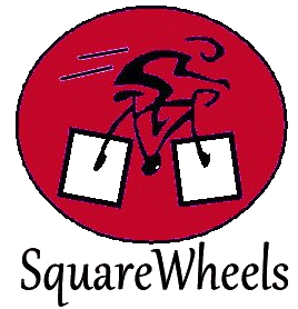
  
  SquareWheels Logo

Team WonderDee
  
  Team Wonderdee's logo reflects, in a stylish uncluttered way, two things representing his life, namely his Norwegian heritage and his star sign of Leo.
  
  Team WonderDee Logo
  
  Burg Pro Cycling
  
  Burg Pro Cycling's logo in third overall was desgined to be simple, contemporary and relevent to cycling. Which you have to say he has achieved with his striking 'cut out' chainring logo.
  
  Burg Pro Cycling Logo


Comments


Team Whalers at 08:43 17/10-2010
  A very nice little article, Ross, but did you check your math? I've looked it over a couple of times and I keep getting 58 points for SquareWheels and 52 for Wonderdee. Were some votes thrown out?
  
  Those two tying for first is a fair result though, as I think they were both in a class above the other contenders. Burg's logo looks great too and is full value for the bronze.


Gradient Levellers at 09:02 17/10-2010
  I'll have a check on the Maths.


Gradient Levellers at 10:27 17/10-2010
  I'm also getting 58 and 52, same as JackO. Will PM Ross to check.


Korten Cycletek at 10:39 17/10-2010
  Yuri was in charge of the maths, I was just the messenger, :s
  
  Looking at it now i wish i had found more stuff to write about but trying to 'generate' content from what is basically a top 10 list takes quite a bit of effort, haha


Velo Club Bored Man at 10:48 17/10-2010
  Jeez how does Wonderdee's logo look so much better than everyone elses?!


Yuri SuperTeam at 11:07 17/10-2010
  Well when i've done the math i'm almost 100% sure they were correct... Maybe someone changed their votes or something... I'm terrible sorry if i was wrong...


Team WonderDee at 11:20 17/10-2010
  Velo Club Bored Man: What do you mean by that?


Velo Club Bored Man at 16:24 17/10-2010
  I mean your logo is miles better than anyone elses and i want one ! :)


Gradient Levellers at 16:26 17/10-2010
  Ok, spoke to Yuri. The Maths was right when he calculated everything and perhaps people have changed their votes etc.
  
  So going to keep the results as they are.


Team WonderDee at 18:41 17/10-2010
  Thanks for the nice words :) I thought you was ironic.